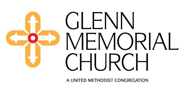
Glenn Memorial has a new logo.
The image you see at the top of the website has been over a year in the making. In January 2014, Glenn’s church council made the suggestion that our congregation explore fresh branding to more effectively communicate its current vibrancy.
Alice Rogers recruited the expertise of congregant and graphic designer, Gordon Boice, to guide Glenn through the process of developing a new logo. With the help of a visioning group made up of staff and laity, the goals for the new logo became clear: capture both the historic and contemporary identity of Glenn, convey that Glenn is a house of worship and Christian community, reinforce Glenn’s presence in the local community, and exhibit Glenn’s attributes of warmth, welcome, and exceptionality.
The new logo took shape out of a carefully coordinated process involving brainstorming, a review of previous logos, and a walk around our campus for visual inspiration. The walk-around proved to be instrumental, as the chosen symbol in the logo is a reflection of the gold cross that hangs in the Chancel of our Sanctuary. As you can see, its distinct qualities are brought together in our logo: the red circle at its heart, the rays coming from the center, the fleur de lis tips on the arms, the arch in which it is framed, and the colors suggested by its materials.
The wording in the logo is intentional. The church council voted on and approved the chosen language: Glenn Memorial Church: A United Methodist Congregation. It emphasizes that Glenn is a United Methodist Christian community and not simply a named building used by a church. The word “congregation” conveys that Glenn is a body of people gathered in a shared and common purpose.
We look forward to the many ways in which the logo will take on life and come to represent and embody the warmth, welcome, and exceptionality found here at Glenn.